Generative Art
The pictures below are artworks generated using the
aRtsy package, which uses some
algorithms with certain parameter and randomization settings to generate
beautiful pieces autonomously.
Space Camo, 2022
Titan Wave, 2022

Outer Land, 2022
Confidence Interval Plots & Interactive Shiny Visualizations
Link to Interactive APP
https://rconnect.bucknell.edu/content/c9c7fa3a-0fbf-4c42-b4e7-19e6950f0564
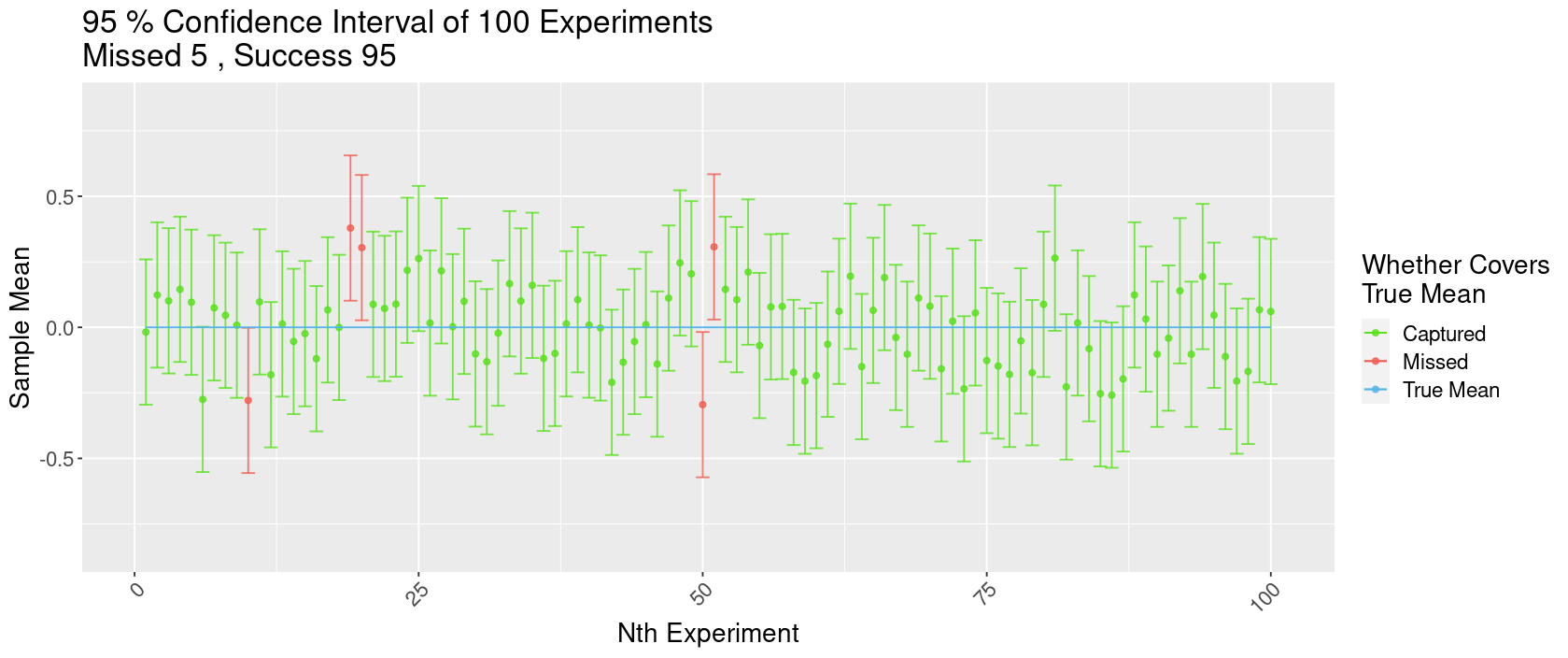
95% Confidence Interval of 100 Experiments
Here is a plot showing the effects of the confidence level on the proportion of intervals that would successfully capture the true mean and the width of confidence intervals. We have randomly generated 100 samples with normal distribution, mean=0, SD=1, and sample size=50. Since our sample are randomly generated, we know what the true “population” mean is – here being 0 since all the samples were generated under \(\mathcal{N}(0,1)\). In these 100 samples, all but 5 of them successful captured the true mean. In the interactive version of this plot, you could adjust the confidence level and notice that the intervals would become wider as confidence level increases, and vice versa. For a 95% confidence interval, we would expect only 95% samples, in repeated sampling, to be able to produce intervals that captures the true mean. And this is exactly what we are see here with our generated “samples” and intervals.
Other Visualizations
ggplot extensions – ggside
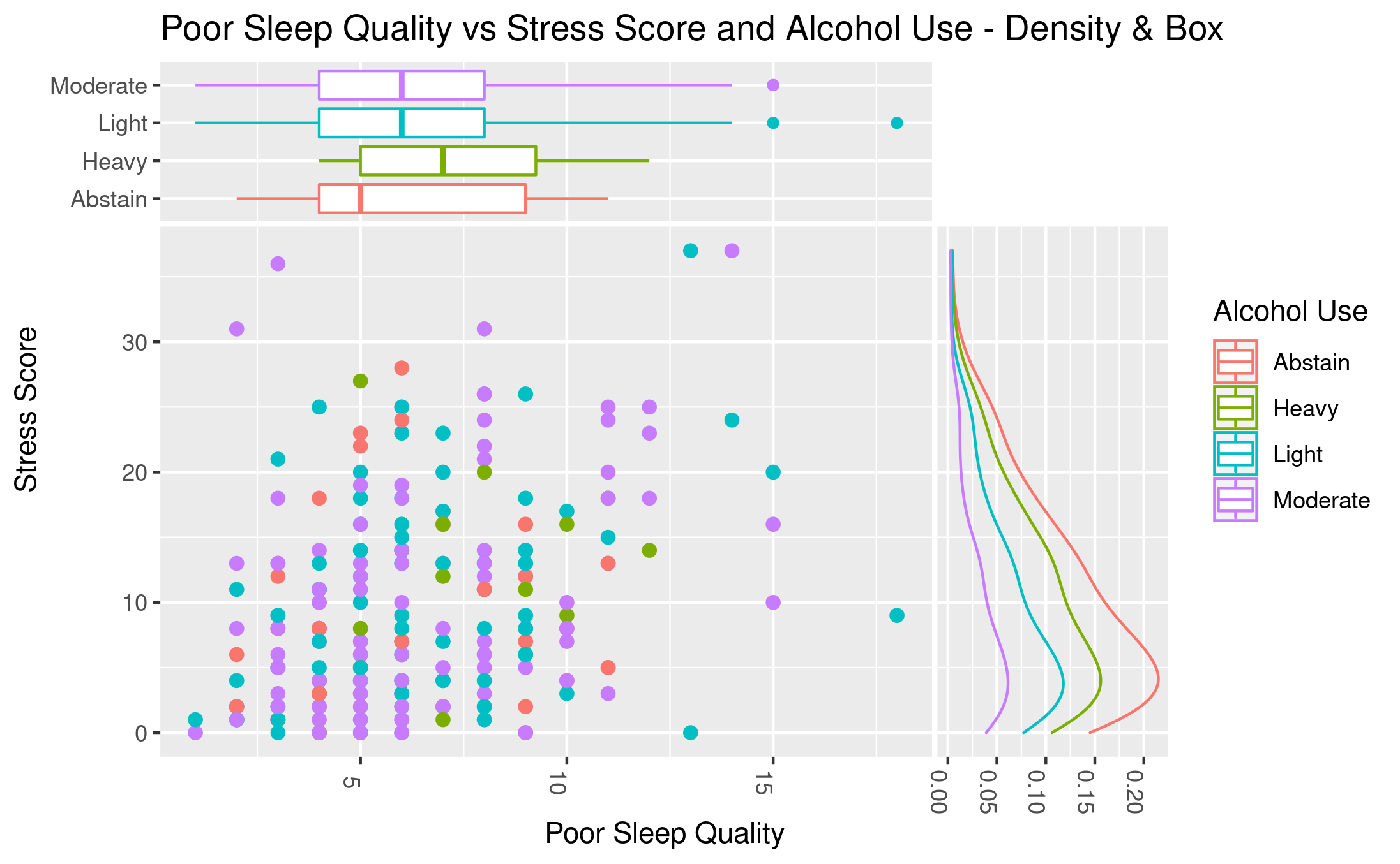
Poor Sleep Quality vs Stress Score and Alcohol Use - Density & Box
This is a plot Gabby, Grace, and I created for our ggplot extensions
project. Our package was ggside , which allows us to see
information (for example, the distribution) regarding a single axis in a
bivariate plot like this scatter plot shown above. We used the
Lock5Data datasets package and the SleepStudy
dataset in it. This dataset contains observations about the sleep
patterns of college students with a sample size of 253. In this plot, we
used PoorSleepQuality and StressScore variables and
scattered them, while also using AlcoholUse to group the
observations. The top side is showing a boxplot of
PoorSleepQuality in each AlcoholUse level; the right
side is showing the density curves of StressScore grouped by
AlcoholUse level. We are trying to see if stress scores might
be correlated with poor sleep quality – so the more stressed a person
is, the worse their sleep quality is; or the worse they sleep, the more
stressed they are. We also also interesting to see if alcohol use was a
factor in here, since we hypothesized that more alcohol use would lead
to both higher stress score and worse sleep quality (meaning a higher
“poor sleep quality”). The results, however, are not indicating a
correlation between PoorSleepQuality vs StressScore
for students in every alcohol consumption level. But, we still found
something interesting thanks to the ggside extension. The boxplot on
PoorSleepQuality indicates that students who don’t drink any
alcohol (Abstain) has the lowest median PoorSleepQuality, while
those who drink heavily has the highest median
PoorSleepQuality. This means that those who don’t drink at all
has the better sleep quality and drinking even “lightly” would result in
worse sleep quality, while drinking heavily would really hurt their
sleep quality.
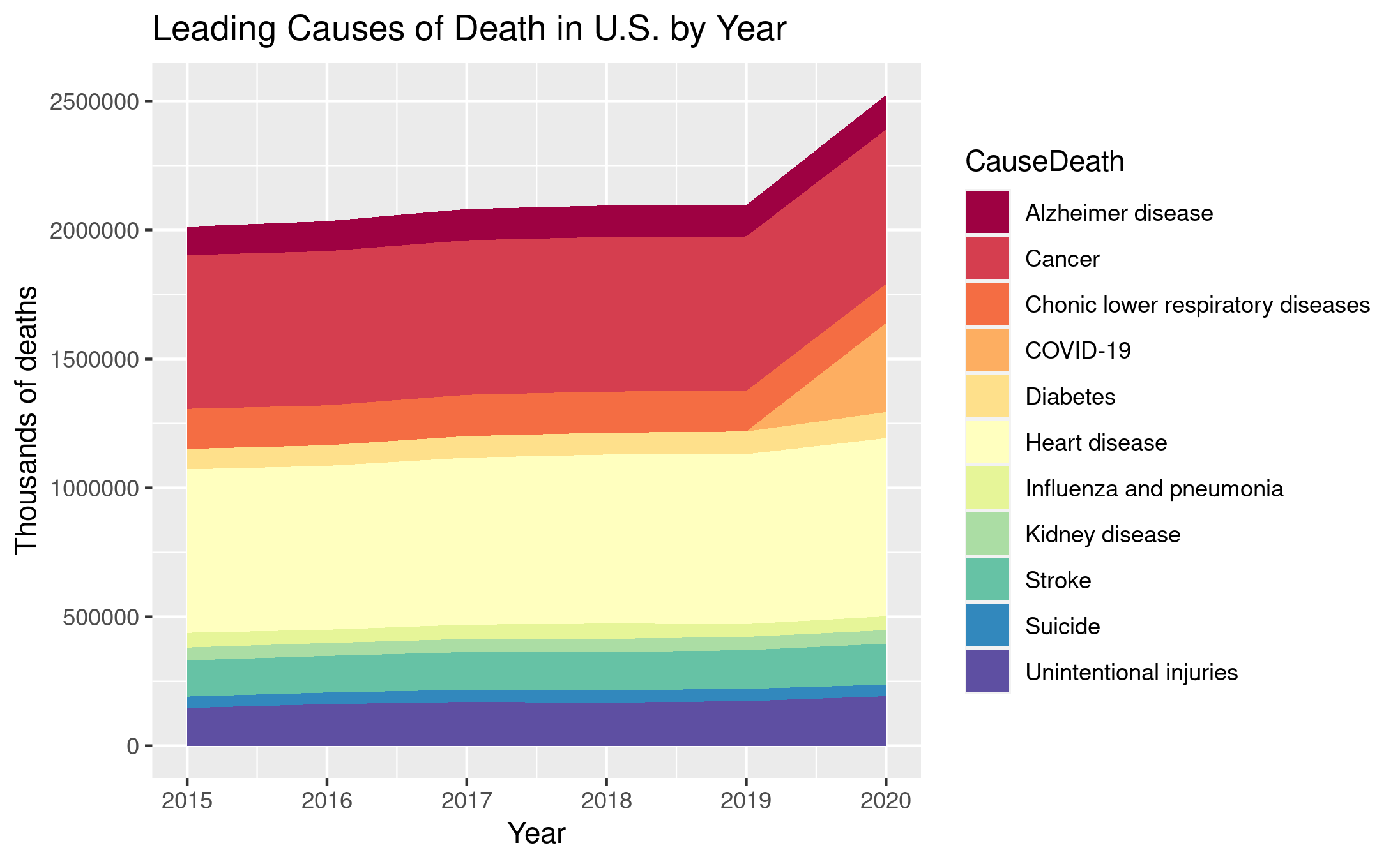
Leading Causes of Death in U.S. by Year
This is a plot I recreated during Exam 2 using provided dataset on US cause of deaths. The variables involved are the time (year) and the number of death in that year, grouped by causes of deaths. We are noticing that total number of death in the US had a jump from 2019 to 2020 – the increase is roughly 300,000 death and almost all of that can be attributed to COVID-19. We are also noticing that there are gradual but slight increases in total number of deaths for all causes in general over the years 2015 to 2019 (before COVID started). I think it might be because of the population growth the US had experiences decades ago. So it is natural to see more deaths; it doesn’t mean people are getting less and less healthy.
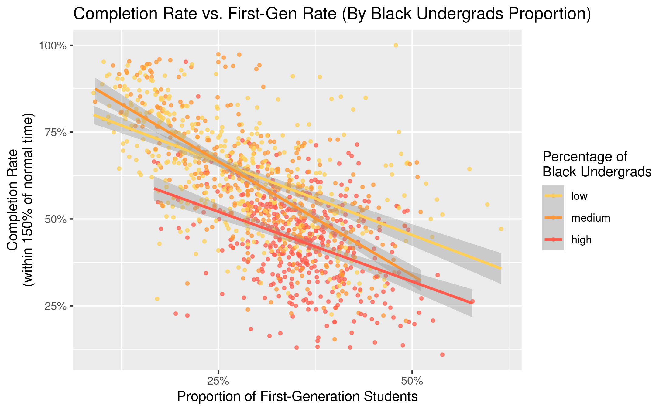
Completion Rate vs. First-Gen (By Black Undergrads Proportion)
I made this plot in Exam 1. The dataset that is used is the
CollegeScores dataset in the Lock5Data
package, on the details about “all US post-secondary schools collected
by the Department of Education for the College Scorecard.” The variables
I used for this plot is the proportion of first-gen college student and
the completion rate (within 150% of normal time) for each college. The
observations are also grouped by the percentage of black Undergrads at
that college. This variable is a categorical was created previously by
slicing the quantitative variable on the proportion of black undergrads
at a college.
We are noticing several things in this scatter plot. Firstly, if we ignore the groupings and the colors for a moment, we see that just the dots alone are showing a moderately strong, linear, and negative correlation between the variables. The higher first-gen proportions are, the lower the completion rates. However, we will notice another thing if we now also take into account of the groups. The regression line for high proportion black undergrads universities is lower than the other two lines, meaning that even if at the same level of first-gen rates, universities with more black undergrads would tend to have lower completion rates.
Besides, we are seeing most of the universities with high proportion of black undergrads located toward the lower right part of the graph. This represents that most universities with high proportion of black undergrads also tend to have higher first-gen rates and lower completion rates.